
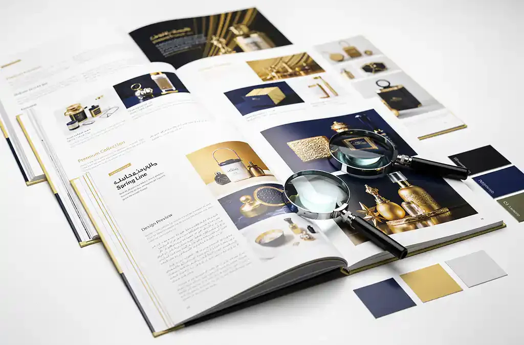
To print a product catalogue that looks professional in every language, you need to treat each language version as a separate design project, not just a text swap. The layout, typography, spacing, and even colour choices may need to change depending on the target language and market. This article walks through the most common questions about multilingual catalogue translation and printing, so you can plan your project with confidence.
What makes a product catalogue look unprofessional in translation?
A product catalogue looks unprofessional in translation when the layout breaks because the translated text is longer or shorter than the original, when fonts do not support the target language’s characters, or when culturally inappropriate images and colour choices are left unchanged. These issues signal to readers that the catalogue was not made for them.
The most visible problem is text overflow. German, for example, tends to run 30 to 40 percent longer than English, which means columns overflow, captions wrap awkwardly, and headlines get truncated. Arabic and Hebrew run right to left, which flips the entire reading direction of a page. Japanese and Chinese require specific character sets that standard Western fonts simply cannot render.
Beyond text, imagery and colour carry cultural meaning. A hand gesture that signals approval in one country can be offensive in another. A colour associated with celebration in one market may signal mourning in a different one. Leaving these unchanged in a translated catalogue tells your audience that the localisation was superficial at best.
How does DTP fit into the multilingual printing process?
Desktop publishing, or DTP, is the stage where translated text is placed back into the original design files and the layout is adjusted to accommodate linguistic and cultural differences. Without DTP, translated content will almost never fit the original design cleanly, and the catalogue will look inconsistent or broken when printed.
A skilled DTP team works in the source files, whether that is InDesign, QuarkXPress, or another format, and makes precise adjustments to text frames, font sizes, line spacing, and image placement. They ensure that the translated version mirrors the visual quality of the original while respecting the new language’s requirements.
For multilingual projects, DTP is not a finishing step. It runs in parallel with translation review and quality checks. The DTP specialist and the linguist often work together to resolve situations where a translation must be shortened to fit a design constraint, or where a layout element must be repositioned to accommodate a longer phrase.
What’s the difference between translating and localizing a catalogue?
Translating a catalogue means converting the text from one language to another. Localising a catalogue means adapting the entire document, including text, images, measurements, currencies, date formats, colour choices, and cultural references, so that it feels native to the target market. Localisation includes translation, but goes significantly further.
A translated catalogue might correctly render every word in French, but still show prices in US dollars, use imperial measurements, or feature imagery that does not resonate with a European audience. A localised catalogue corrects all of these elements so the end reader never feels they are reading a foreign document that has been converted.
For product catalogues specifically, localisation often involves adapting product names that carry unintended meanings in the target language, updating regulatory information that differs by country, and ensuring that technical specifications use locally recognised standards. These details matter enormously in industries like manufacturing, healthcare, and consumer electronics.
Which languages are the hardest to print catalogues in?
The most technically demanding languages for printed catalogues are Arabic, Hebrew, Thai, Japanese, Chinese, and Korean. These languages require right-to-left text direction, complex script rendering, or large character sets that standard design workflows are not built to handle without specific preparation.
Arabic and Hebrew both read right to left, which means the entire catalogue layout, including column order, image placement, and navigation flow, needs to be mirrored. Most design software supports this, but it requires a DTP specialist who is experienced with bidirectional text rather than someone simply switching a setting.
Japanese, Chinese, and Korean involve thousands of characters and require fonts that can be very large in file size. Line breaking rules differ from Western languages, and vertical text is sometimes preferred. Thai has no spaces between words, which creates unique challenges for text justification and hyphenation logic in design software.
Languages with significant text expansion, such as German, Finnish, and Hungarian, also require extra DTP attention even though they use Latin scripts. The challenge there is purely spatial rather than technical, but it is just as capable of ruining a layout if not planned for.
Should you use a single vendor for translation, DTP, and printing?
Yes, using a single vendor for translation, DTP, and printing is strongly recommended for multilingual catalogue projects. When these processes are handled by separate providers, handoff errors, file format mismatches, and communication delays compound quickly across multiple language versions, increasing both cost and the risk of quality failures.
When one team manages the full workflow, the translator, DTP specialist, and print production team share the same files, the same style guides, and the same understanding of the project’s requirements. Changes made during translation review are immediately reflected in the layout without a separate round of file transfers and briefings.
We work exactly this way at Crestec Europe, managing translation, DTP, and printing as an integrated process. This means that when a German text string runs long or an Arabic layout needs to be mirrored, the adjustment happens within the same project team rather than requiring a new vendor conversation. The result is faster turnaround and fewer errors reaching the print stage.
How do you ensure print quality stays consistent across 10+ language versions?
Consistent print quality across multiple language versions requires a combination of centralised style guides, standardised file preparation, a single print specification applied across all versions, and a structured review process that checks each language version against the same quality criteria before it goes to press.
Start with a master style guide that defines typography rules, colour values in CMYK, bleed and margin settings, and approved image assets. Every language version should be built from the same master template rather than each team starting from a different file. This eliminates the drift that accumulates when multiple DTP teams work independently.
Before printing, each language version should go through a native-language proof review. This catches errors that only a native speaker would notice, such as incorrect hyphenation, widows and orphans in the text, or a line break that falls in an awkward place in that language. A final prepress check then confirms that colour profiles, resolution, and bleed are consistent across all files before they are sent to press.
For large multilingual print runs, working with a provider who handles all versions under one roof removes a significant source of inconsistency. If you are planning a catalogue project in multiple languages and want to explore how we can support the full process, request a quote or get in touch with our team to discuss your requirements.
Frequently Asked Questions
How far in advance should we start planning a multilingual catalogue print project?
For a catalogue in 5 or more languages, plan for at least 8 to 12 weeks from the point you have finalised English content to when you need printed copies in hand. This timeline accounts for translation, DTP adjustments per language, native-language proof reviews, and print production. Complex language combinations — particularly those involving Arabic, Japanese, or Chinese — should sit at the longer end of that range. Starting with a finalised source document is critical; changes made to the English original mid-project cascade across every language version and multiply the time and cost significantly.
What file formats should we provide to a multilingual DTP team?
Provide native source files wherever possible — InDesign (.indd) with all linked assets packaged, or the equivalent for QuarkXPress or other tools. Avoid supplying PDFs as the working files, as these require reconstruction before any layout adjustments can be made, which adds time and cost. Along with the source files, include your fonts, a colour swatch file with CMYK values, any image assets at full resolution, and a copy of your brand or style guide. The more complete your handoff package, the fewer delays your DTP team will encounter.
Can we reuse our existing English catalogue layout as the master template for all language versions?
Your English layout can serve as the starting point, but it should not be treated as a fixed master that every language version must conform to without modification. Instead, use it as a structural reference and build language-specific templates that inherit the core design but allow for text expansion, directional changes, and typographic adjustments. For example, a layout optimised for concise English copy will likely need wider text frames and adjusted font sizes for German, and a fully mirrored grid for Arabic. Treating the English layout as flexible from the outset saves significant rework later.
What happens if a product name or slogan doesn't translate well into a target language?
This is more common than most teams expect, and it is one of the strongest arguments for working with translators who specialise in your industry rather than general linguists. When a product name carries an unintended meaning, sounds awkward phonetically, or simply has no equivalent concept in the target language, the solution is usually transcreation — a process where the name or slogan is creatively adapted rather than literally translated. Your translation and DTP team should flag these issues during the translation stage, before they reach the layout, so that any approved alternative fits within the existing design space.
How do we handle version control when multiple language versions are being updated simultaneously?
Establish a single source-of-truth document that logs every approved change to the master English content, and ensure that change is propagated to all active language versions before any file is sent to press. Use clearly named file versioning conventions — for example, including the language code, version number, and date in every filename — and restrict who can approve final files for print. For larger projects, a project management platform or even a shared tracker document can prevent the common mistake of printing an outdated language version because an update was applied to the English master but not communicated to the relevant DTP file.
Is it worth printing a physical proof for every language version, or is a digital proof sufficient?
For a first print run or a catalogue with complex colour requirements, a physical proof for at least a representative sample of language versions is strongly recommended. Digital proofs cannot fully replicate how ink sits on a specific paper stock, how colours shift between screen and print, or how fine text renders at small sizes in character-heavy scripts like Japanese or Chinese. If budget is a constraint, prioritise physical proofs for the languages with the most complex scripts or the highest print volumes, and use calibrated soft proofing for the remaining versions — but only if your print provider can guarantee colour consistency across all files.
What is the most common mistake companies make when printing catalogues in multiple languages for the first time?
The most common mistake is treating translation as the last step rather than an integrated part of the design process. Teams frequently finalise the English layout completely — locking down text frames, image positions, and page counts — and then send it for translation, only to discover that the translated content cannot physically fit the design. Rebuilding layouts at that stage is expensive and time-consuming. The better approach is to design with text expansion in mind from the beginning, leave flexibility in text frames, and involve your translation and DTP team early enough to flag language-specific constraints before the English design is locked.
Related Articles
- How do I ensure consistent quality in print materials across multiple printing partners?
- What should I keep in mind when translating and printing multilingual documentation?
- My printed materials need to be FSC- and EUDR-compliant — who can handle that? The Netherlands? Germany? Europe?
- Do my manuals need to be translated into all the languages spoken in our target markets?
- How do I make sure my product message isn't misunderstood abroad?