
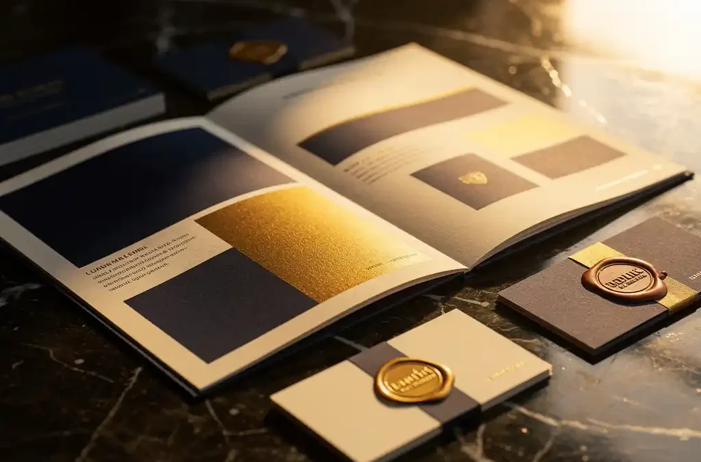
Print materials help your brand project a premium image by delivering tangible quality signals that digital communication simply cannot match. When a customer picks up a business card, brochure, or package, the physical experience instantly forms a judgment about the value of your brand. The questions below walk you through how to use print strategically to build and reinforce that premium perception. If you have questions about what we can do for you, feel free to get in touch.
What role does print play in brand perception?
Print plays a direct and measurable role in how customers experience a brand. Physical printed materials communicate quality, reliability, and attention to detail in a way that a screen cannot replicate. The texture of paper, the weight of a card, and the sharpness of a print are all signals that the brain associates with the value of a product or service.
For many customers, print is the first tangible point of contact with an organization. A well-designed brochure or a neatly finished manual says something about how a company approaches its work. Sloppy or cheap print raises doubt, even when the product itself is excellent. Documentation is therefore part of the customer journey that shapes the overall appreciation for a product or service.
Print also functions as a silent ambassador. A business card left on a desk, a catalog kept for reference, or a product label that catches the eye every day create repeated exposure to your brand at no additional cost.
What makes print materials feel “premium” to the customer?
Premium print distinguishes itself through the combination of materials, finishing, and consistency with the brand’s visual identity. Customers assess quality instinctively: a heavier paper weight, a matte or gloss laminate, embossing, or spot UV coating are finishes that immediately evoke a sense of exclusivity.
Beyond the physical properties, the precision of execution plays a major role. Colors that exactly match brand guidelines, sharp typography, and clean trimming communicate craftsmanship. Customers do not need to consciously analyze this — the feeling of quality arises naturally from well-executed print.
Another hallmark of premium print is the relevance of the content. Material that is accurate, well translated, and tailored to the recipient’s needs strengthens the credibility of the brand. An error in the text or a poor translation detracts from even the most beautifully produced print.
How does a consistent visual identity in print build brand recognition?
A consistent visual identity in print builds brand recognition because repeated exposure to the same colors, fonts, and graphic elements creates a recognizable pattern in the customer’s memory. The more often someone encounters those visual elements, the stronger the association with the brand becomes.
Consistency works on multiple levels. At the level of individual materials, it means that a brochure, a business card, and a product label look as though they belong together. At the level of the overall brand experience, it means that print materials align with the website, social media, and other communication channels. When all those elements are coordinated, the customer experiences a cohesive brand rather than a collection of disconnected outputs.
In practice, this requires a well-managed DTP process in which brand guidelines are applied consistently, even when materials are produced in multiple languages. An integrated approach in which translation, layout, and print are managed within a single workflow reduces the risk of deviations that undermine consistency.
Which print materials do the most to reinforce a premium brand experience?
The print materials that most effectively reinforce a premium brand experience are high-quality coated paper, heavy-weight board, and materials with special finishes such as soft-touch laminate, embossing, or foil printing. These choices signal investment and attention to detail, which translates directly into a higher perceived brand value.
Paper and board
The foundation of premium print lies in the choice of paper. A higher grammage, a crisp white or a warm natural tone, and a smooth or lightly textured coating determine how the material feels and looks. For brochures and catalogs, coated paper with a matte or silk finish is a reliable choice. For packaging and cards, heavy board provides both sturdiness and a premium appearance.
Finishing techniques
Beyond the base material, finishing techniques are what make print truly stand out. Spot UV on a logo, gold foil on a heading, or embossing on a business card are details that the recipient notices — consciously or not. Large-format materials for trade shows and events also benefit from high-quality finishing, as they shape the first impression of a stand or presentation.
How does multilingual print affect international brand image?
Multilingual print strengthens international brand image by demonstrating that an organization takes its customers seriously, regardless of their language or location. Material in the recipient’s own language communicates respect and professionalism, which directly builds trust in the brand.
The challenge with multilingual print lies in consistency. When the same message needs to be printed in ten languages, it is essential that the visual identity remains intact in every version. Text expansion or contraction during translation can disrupt the layout, colors may carry different cultural meanings from country to country, and local guidelines for text and imagery can vary.
A streamlined approach in which translation, DTP, and print production are managed by a single partner prevents coordination errors and shortens turnaround times. When all these steps are integrated into one workflow, the brand experience remains consistent across all languages and updated materials reach the market faster.
When does it make sense to combine print and localization?
It makes sense to combine print and localization as soon as you are producing materials for multiple language markets, or when an existing product or service is being introduced in a new country. In those situations, localization is not an optional step but a prerequisite for a credible and effective brand presence in that market.
Localization goes beyond translation. It involves adapting images, color usage, units of measurement, currency, and cultural references so that the material feels as though it was made for the local market. When this process is disconnected from the print process, it creates risks of errors, delays, and additional costs from revision rounds.
For organizations that regularly publish new product information, marketing materials, or technical documentation in multiple languages, an integrated approach makes structural sense. A partner that manages translation, layout, storage, and distribution under one roof reduces the coordination burden and ensures that every market is served simultaneously. We offer exactly that combined approach — from localization to finished printed product. Get in touch and discover what we can do for your international brand image.
Frequently Asked Questions
How do I start upgrading my existing print materials to a premium level?
Start with an audit of your current print materials: identify which pieces are handled most often by customers and begin improvements there. Focus first on high-impact changes such as a heavier paper weight or a matte laminate on business cards and brochures, as these are immediately noticeable to the recipient. Then work from a brand guidelines document to ensure all new materials are produced consistently.
What are the most common mistakes when producing premium print materials?
One of the most common mistakes is cutting costs on paper weight or finishing while the design itself is high quality — the result then feels unbalanced. Other frequent errors include color deviations caused by supplying RGB files instead of CMYK, and insufficient attention to bleed margins, which causes the trim to damage the design. Always work with a print partner who technically checks your files before production.
How do I keep my print materials consistent when working with multiple suppliers?
Consistency across multiple suppliers requires a detailed brand manual with exact color values (Pantone, CMYK), fonts, margins, and finishing specifications. Consider working with a single dedicated partner for strategic print items — such as business cards, brochures, and packaging — who knows and upholds your brand standards. If you do use multiple suppliers, always have a proof approved before the full print run is produced.
How much more does premium print cost compared to standard print, and is it worth it?
The additional cost of premium print typically ranges from 20% to 60% above standard print, depending on the finishing techniques chosen and the print run size. That investment pays off because premium materials are kept longer, passed on more often, and create a higher perceived product value — which has a direct influence on purchasing decisions. For materials that shape a first impression, such as proposal folders, packaging, or trade show materials, the return on investment is generally the greatest.
What do I need to supply to a print partner to ensure a smooth production process?
Supply your files as print-ready PDFs in CMYK color mode, with embedded fonts, a bleed of at least 3 mm, and crop marks. Also include a color profile or Pantone references so the print partner can accurately reproduce your brand colors. The more complete and technically correct your submission, the lower the risk of delays or unexpected costs from revision rounds.
How do I keep multilingual print manageable when my product information is updated frequently?
The key to manageable multilingual print with frequent updates is a structured content workflow: work with one source file per language and ensure that changes are tracked centrally before they go to layout and print. An integrated partner that combines translation, DTP, and print eliminates coordination between separate links in the chain and significantly shortens turnaround times. Also consider digital distribution of updated versions alongside physical print, so markets can be served immediately whenever content changes.
Which finishing technique suits my type of business or industry best?
The choice of finishing technique depends on the message your brand wants to convey: soft-touch laminate and matte spot UV radiate refinement and calm, and are well suited to luxury brands, consulting firms, and healthcare. Foil printing and embossing are powerful choices for sectors where exclusivity is central, such as fashion, jewelry, or high-end technology. For industrial or technical sectors, a clean, clear finish on heavy coated paper is often more credible than decorative techniques — consistency and legibility take priority there.
Related Articles
- How do I combine translation, layout, and printing in one efficient process?
- What is the Triman logo and what does it mean for exporting my products and manuals to France?
- Who can translate, format, print, and distribute my manuals?
- How do I set up an ordering portal for my product documentation?
- How do I keep my technical documentation up to date when my product keeps changing?