
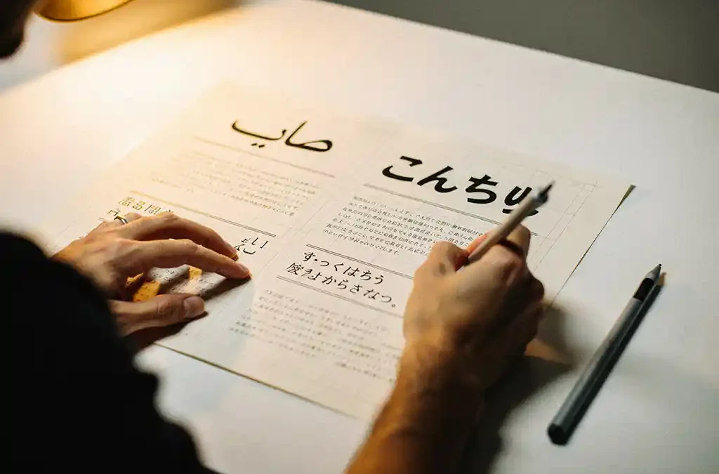
To add Arabic or Japanese text to an existing InDesign document, you need to use Adobe InDesign’s Middle Eastern or World-Ready Composer settings and ensure your document is configured for right-to-left or CJK (Chinese, Japanese, Korean) text handling. Without the correct composer and font settings enabled, InDesign will not render Arabic or Japanese characters correctly. This guide walks through every key question you are likely to face along the way, from initial setup to knowing when to bring in a specialist for translation and localisation support.
Does InDesign support Arabic and Japanese text natively?
Yes, InDesign supports both Arabic and Japanese text natively, but the level of built-in support depends on which version and edition you are using. The standard InDesign version includes robust support for Japanese through its CJK composer, while full Arabic support requires either the Middle Eastern edition or the World-Ready Composer available in more recent versions of InDesign CC.
For Japanese, InDesign has included dedicated Japanese typography tools for many years, including features like kumi-moji (combined characters), warichu (inline notes), and vertical text frames. These tools are accessible in any current InDesign CC subscription.
For Arabic, the World-Ready Composer introduced in InDesign CC 2015 brought right-to-left text support into the standard application. If you are using an older version, you may need the dedicated Middle Eastern edition to access full Arabic layout capabilities. In 2026, most users on an active Creative Cloud plan will have access to these features through the standard application.
What settings do you need to enable before adding Arabic text?
Before placing Arabic text into an existing InDesign document, you must enable the World-Ready Composer, set the paragraph direction to right-to-left, and select a font that includes Arabic glyphs. Skipping any one of these steps will result in broken or unreadable text, even if the translation itself is correct.
Here is the sequence to follow:
- Enable the World-Ready Paragraph Composer: Open the Paragraph panel menu and select “World-Ready Paragraph Composer.” This tells InDesign to handle bidirectional and right-to-left text properly.
- Set paragraph direction to right-to-left: In the Paragraph panel, switch the text direction from left-to-right to right-to-left. This affects alignment, punctuation placement, and the overall flow of the text frame.
- Choose an Arabic-compatible font: Use a font that includes Arabic Unicode support, such as Adobe Arabic, Noto Naskh Arabic, or any OpenType font designed for Arabic script. Standard Latin fonts will not contain Arabic glyphs and will display boxes instead.
- Check your text frame direction: If the document was originally built for a left-to-right language, individual text frames may also need their direction flipped. You can do this in the Text Frame Options panel.
It is also worth checking that your document’s language settings are updated. Go to Edit > Language and make sure Arabic is listed and active. This ensures spell-check and hyphenation rules do not interfere with your Arabic content.
How do you correctly place Japanese text into an existing InDesign layout?
To place Japanese text into an existing InDesign layout, switch the paragraph composer to the CJK (Chinese, Japanese, Korean) composer, select a Japanese-compatible font such as a Kozuka or Hiragino typeface, and set the language in the Character panel to Japanese. This gives InDesign the rules it needs to handle spacing, line breaking, and character combinations correctly.
Japanese text introduces some layout-specific considerations that differ from European languages:
- Text expansion: Japanese translations of English content are often longer in character count and can cause text overflow in existing frames. Plan for reflow before placing the text.
- Vertical text: Japanese is frequently set vertically, particularly in product manuals and packaging. If your layout calls for vertical text, create a vertical text frame and apply the appropriate vertical composer settings.
- Mojikumi settings: These control the spacing around Japanese punctuation and are important for professional-quality output. InDesign includes preset mojikumi tables that you can apply through the Paragraph panel.
- Kinsoku rules: These define which characters cannot appear at the start or end of a line. Applying the correct kinsoku set prevents awkward line breaks that would look unprofessional to a Japanese reader.
If you are adapting a document that was originally designed in English, expect to spend time adjusting frame sizes and tracking. Japanese characters are generally wider than Latin characters, and the proportions of your original layout may not translate directly.
Why does Arabic or Japanese text appear as boxes or garbled characters?
Arabic or Japanese text appears as boxes or garbled characters in InDesign when the active font does not contain the required Unicode glyphs for those scripts. This is the most common cause. Secondary causes include an incorrect composer setting, a missing language pack, or the text being pasted in a format that strips encoding information.
Boxes (sometimes called “tofu”) indicate that InDesign recognises a character exists but cannot find a matching glyph in the current font. The fix is straightforward: select the affected text and apply a font that supports the script you are working with.
Garbled characters, on the other hand, often point to an encoding problem. This typically happens when text is copied from a source that uses a different encoding standard, or when a PDF is exported and then reimported without preserving Unicode data. Always work with UTF-8-encoded text files when supplying content for Arabic or Japanese localisation.
Another common trigger is using the standard Adobe Paragraph Composer instead of the World-Ready or CJK composer. Even with the correct font applied, the wrong composer can cause characters to render out of sequence or in the wrong direction, particularly for Arabic, where letters connect and change shape depending on their position in a word.
Should you use a separate InDesign file or adapt the existing document for multilingual content?
For most projects, adapting the existing InDesign document is the preferred approach because it preserves your original design structure, styles, and assets. However, creating a separate file makes more sense when the target language requires a fundamentally different layout direction, such as Arabic, or when the translation will cause significant text expansion that affects the entire document structure.
There are practical arguments for both approaches:
Adapting the existing document
Keeping a single source file reduces version control complexity and makes it easier to apply global design changes across all language versions. InDesign’s layers feature allows you to keep the original language on one layer and the translated content on another, which simplifies proofreading and comparison. This works well for Japanese, where the layout direction is often the same as the source document.
Creating a separate file for right-to-left languages
Arabic presents a stronger case for a separate file. Because the entire reading direction is reversed, text frames, tables, bullet lists, and even image placement logic may need to be mirrored. Attempting to force a right-to-left language into a left-to-right master file can introduce structural conflicts that are time-consuming to resolve. Starting from a mirrored copy of the original file, with all frames and elements repositioned for right-to-left reading, often produces cleaner results and a more professional final output.
Whichever approach you choose, establish a clear naming convention and file management system before you begin. Multilingual InDesign projects can grow quickly in file count, and clear organisation prevents errors during the final production stage.
When should you hand Arabic or Japanese DTP work to a specialist?
You should hand Arabic or Japanese DTP work to a specialist when the document requires script-specific typography rules you are not familiar with, when the layout involves vertical text, complex table structures, or highly formatted technical content, or when the final output will be printed or published professionally and errors could damage your brand. The risk of invisible but significant errors is high without native-language DTP expertise.
Arabic and Japanese are both scripts where typographic quality is immediately noticeable to native readers. Incorrect kashida usage in Arabic, wrong kinsoku settings in Japanese, or poorly spaced mojikumi can make an otherwise accurate translation feel unprofessional. For marketing materials, product documentation, or any customer-facing content, these details matter.
Specialist DTP teams who work with these languages every day bring more than just technical InDesign knowledge. They understand the cultural expectations around layout, reading direction, and visual hierarchy that a general designer may not be aware of. This is particularly relevant for Japanese content, where the relationship between text density, white space, and visual balance follows conventions that differ from European design traditions.
If you are working on a documentation or localisation project that involves Arabic or Japanese, we are here to help. Our team combines translation, localisation, and DTP expertise across more than 90 languages, and we manage the full process from source text to print-ready file. Request a quote to discuss your project, or get in touch and we will walk you through the best approach for your specific document and language combination.
Frequently Asked Questions
Can I add Arabic or Japanese text to an InDesign document without a Creative Cloud subscription?
If you are using an older perpetual licence version of InDesign (CS6 or earlier), your options are significantly limited. Full Arabic support in the standard application only became available with InDesign CC 2015 and the introduction of the World-Ready Composer, while the Middle Eastern edition was previously the only route for right-to-left layouts. For Japanese, older versions do include CJK support, but you will miss out on refinements introduced in later CC releases. Upgrading to an active Creative Cloud subscription is the most practical solution for anyone working regularly with Arabic or Japanese content.
How do I prevent text overflow when placing a Japanese or Arabic translation into an existing English layout?
Text expansion is one of the most common layout challenges in multilingual DTP. Japanese translations of English text can run 10–30% longer in terms of character count, while Arabic translations can vary significantly depending on the source content. Before placing translated text, duplicate your existing frames and temporarily unlock them so you have room to adjust. It also helps to build some flexibility into your original design by avoiding tightly fitted text frames and using paragraph styles with auto-leading, so that minor adjustments can be made globally rather than frame by frame.
What is the best way to handle mixed left-to-right and right-to-left text in the same InDesign document?
Mixed-direction documents, such as a bilingual English and Arabic brochure, require careful use of the World-Ready Paragraph Composer and precise control over paragraph direction settings at the text frame level. The key is to treat each language block as its own self-contained unit with its own direction and style settings, rather than trying to mix directions within a single text frame. Using separate layers for each language version, combined with clearly named paragraph styles for each script, will save significant time during proofreading and any subsequent edits.
Are there any InDesign plugins or third-party tools that make Arabic or Japanese DTP easier?
Yes, several tools can streamline multilingual DTP workflows. For Arabic, plugins such as Arabick and Winsoft’s Middle Eastern plug-in have historically extended InDesign’s capabilities for older versions, though most of their functionality is now built into current CC releases. For Japanese, the built-in mojikumi and kinsoku settings cover most professional needs, but tools like Em Software’s InData can help automate content placement for data-heavy documents. For translation workflow integration, SDL Trados and memoQ both support IDML file formats, allowing translated content to be imported back into InDesign without manual copy-pasting.
How should I export an InDesign file containing Arabic or Japanese text to PDF to ensure the characters display correctly?
When exporting to PDF, always choose the ‘Export to PDF (Print)’ option with fonts fully embedded, and ensure that ‘Use Document Bleed Settings’ is enabled if the file is going to print. In the Advanced tab of the PDF export dialogue, make sure the colour profile and compatibility settings match your output requirements, and avoid downsampling or subsetting fonts below 100% if your Arabic or Japanese text includes a wide range of glyphs. It is also good practice to open the exported PDF in Adobe Acrobat and run a preflight check to confirm that all glyphs have rendered correctly before sending the file to a printer or client.
What common mistakes should I avoid when setting up an InDesign document for Arabic or Japanese for the first time?
The most frequent mistakes are applying a Latin font and expecting Arabic or Japanese glyphs to appear, forgetting to switch the paragraph composer before placing text, and neglecting to update the document language settings, which can cause spell-check to flag every word as an error. Another common oversight is copying text directly from a web browser or Word document without checking its encoding, which can introduce invisible formatting characters that disrupt Arabic letter joining or Japanese line-break logic. Always paste text as plain UTF-8 content first, then apply your InDesign paragraph and character styles on top.
How do I know if my Arabic or Japanese InDesign file is ready for professional printing?
Before sending any multilingual file to print, have the document reviewed by a native-language reader who can also evaluate the typographic quality, not just the translation accuracy. On the technical side, run InDesign’s built-in preflight check to catch missing fonts, overset text, and resolution issues. Confirm that all Arabic text flows correctly from right to left, that no characters have defaulted to a fallback font, and that Japanese kinsoku and mojikumi settings have been applied consistently throughout the document. For high-stakes print runs, requesting a soft proof or hard proof from your printer before approving the final file is always worthwhile.
Related Articles
- How do I make a translated document look as good as the original?
- How do I maintain a consistent brand identity in printed materials across multiple European markets?
- How can I ensure that the brand identity comes through in all my documentation?
- How do you manage multilingual documentation?
- What infrastructure supports scalable localisation?