
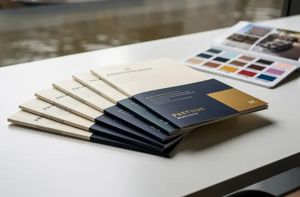
Achieving a consistent brand identity across printed materials for multiple European markets requires combining one central brand guidelines document with locally adapted production processes. The key lies in defining fixed brand elements — such as color values, typography, and logo usage — while leaving room for linguistic and cultural adaptations per country. If you have questions about how to approach this in practice, feel free to contact us. The sections below explore each aspect of this topic in greater depth.
Which elements define brand identity in printed materials?
Brand identity in printed materials is shaped by a combination of visual and communicative elements that together create brand recognition. The most important are: the logo and its clear space, the color palette in exact print values (CMYK and Pantone), typographic choices, visual language, and the tone of the copy.
With printed materials, technical specifications play a greater role than with digital communications. Colors behave differently on paper than on screen, and the choice between offset and digital printing affects how a color ultimately appears. Paper type, finish (matte, gloss, laminated), and format are also part of the brand experience. A brand that takes its identity seriously documents all these technical parameters in writing, so that every print production — regardless of country or supplier — delivers the same result.
Why does print output vary so significantly from country to country in Europe?
Print output varies across Europe because language, culture, regulations, and technical print standards differ from market to market. What comes across as professional and clear in the Netherlands may seem too informal in Germany, or may not align with local aesthetic expectations in France. In addition, some countries impose specific requirements for product labels, safety information, or paper formats.
Linguistic variation is the most visible cause of inconsistency. A translation typically takes up more or less space than the source text, which means the layout differs across language versions. German is on average longer than English, while Finnish can be more compact. This has a direct impact on the layout of brochures, manuals, and packaging.
There are also cultural preferences when it comes to color and visual language. Colors carry different connotations in different cultures, and what is appealing in one market may have the opposite effect in another. A well-considered brand guidelines document accounts for these variations without losing sight of the brand’s core identity.
How do you create a brand guidelines document for European print productions?
To create a brand guidelines document for European print productions, start by defining the fixed brand elements, then describe the permitted local adaptations for each market. The document serves as the single source of truth for everyone involved in producing printed materials, from designers to printers.
What belongs in the fixed section?
The fixed section contains the logo in all approved variations, the exact Pantone and CMYK color values, the primary and secondary typefaces, the minimum logo size, and the clear space around the logo. The core principles of image use — such as photography style and illustration style — also belong here. These elements must never be modified, regardless of country or medium.
What can be adapted locally?
The local section describes which adaptations are permitted. This includes the use of local languages, regional color variants for special campaigns, and layout adjustments resulting from differences in text length. By explicitly defining this flexibility, you prevent local teams from making their own decisions that undermine brand consistency.
What role do DTP and layout play in international consistency?
DTP (Desktop Publishing) and layout play a crucial role in international consistency because they bridge the gap between translated text and the final print-ready file. Without professional DTP processing, a translation almost always leads to layout issues that compromise brand identity.
When a text is translated, the text length changes. Headings become longer or shorter, bullet points no longer fit on a single line, and tables lose their proportions. An experienced DTP team adjusts the layout so that the design remains intact, the hierarchy stays readable, and brand guidelines are followed. This applies to each language version individually.
At our company, the DTP team works closely with translators and printers. This means layout adjustments are incorporated during the translation process itself, preventing errors and delays. The result is a print-ready file that meets both brand requirements and technical print specifications — for every European market individually.
When is a centralized production approach the better choice?
A centralized production approach is the better choice when you are producing print materials for five or more European markets, when past brand errors have led to reprints, or when coordinating multiple local suppliers has become too time-consuming and risky.
With a decentralized approach — where each market engages its own printer and designer — brand guidelines are likely to be interpreted in different ways. One printer uses a slightly different color setting; another adjusts the typeface because the original is unavailable. Over time, this leads to brand dilution that is difficult to reverse.
A centralized partner that manages translation, print production, storage, and distribution under one roof eliminates these coordination risks. All versions are produced from the same brand foundation, with controlled processes and a single point of contact. This also significantly reduces turnaround time when a product is updated and revised materials need to reach multiple markets quickly.
How does quality certification safeguard the consistency of your brand communications?
Quality certification safeguards brand consistency by requiring that production processes are documented, controlled, and repeatable. A certified supplier does not work by instinct, but follows established procedures that are applied to every job.
ISO 9001 is the most relevant certification for print production and document management. It confirms that an organization has a structured quality management system in place, from receiving a job to delivering the final product. This means deviations are identified and corrected before they reach the printed output.
ISO 27001 is relevant when you share brand files, print templates, and product data with an external partner. This certification confirms that confidential business information is managed securely. We are certified for both ISO 9001 and ISO 27001, and both certifications were renewed in 2024 for a period of three years. For organizations managing brand communications across multiple countries, this provides assurance that quality and information security are structurally guaranteed — not left to chance.
Want to know how we can manage your print productions for multiple European markets consistently and efficiently? Contact us for a no-obligation conversation.
Frequently Asked Questions
How long does it take to create a brand guidelines document suitable for multiple European markets?
The timeline for a complete brand guidelines document for European print productions typically ranges from two to six weeks, depending on the complexity of the brand and the number of markets involved. An accelerated process is possible if the core brand elements are already defined and only the international extension needs to be documented. It is worth doing this thoroughly once: a well-crafted brand guidelines document delivers significant long-term savings in reprint costs and correction time.
What are the most common mistakes companies make when producing print materials for multiple European markets?
The most common mistake is engaging local printers per market without central quality control, causing color values, typefaces, and layouts to diverge from country to country. A second frequent error is submitting translated texts without DTP post-processing, which leads to layout issues such as overflowing text or a disrupted visual hierarchy. Finally, many companies underestimate cultural color and image connotations, causing campaign materials to unintentionally convey the wrong message in certain markets.
How do I handle text length differences when my design offers little room for adjustments?
For tight designs with limited layout flexibility, it is advisable to account for text expansion during the design phase itself — by reserving approximately 20–30% extra space for languages such as German or Finnish. If that is not possible, an experienced DTP team can work with slightly adjusted character spacing, smaller point sizes within brand guidelines, or alternative hyphenation rules, without compromising the visual identity. In extreme cases, a shortened, condensed translation that retains the core message can be agreed upon in consultation with the brand owner.
Is it possible to have my existing print materials reviewed for brand consistency before starting new productions?
Yes, a brand audit of existing print materials is a worthwhile first step, especially if you are already active in multiple European markets and suspect that inconsistencies have developed. During such an audit, all materials are assessed against the established brand guidelines in terms of color, typography, logo usage, and layout. The outcome provides a clear picture of which materials require an immediate reprint and which can be incorporated into the next regular production run, avoiding unnecessary costs.
How does the storage and distribution of print materials for multiple European countries work in practice?
With a centralized approach, all approved print versions per market are stored in one managed environment, often combined with a fulfillment service that ships orders directly to the appropriate European locations. This prevents local offices from maintaining their own inventories of outdated versions, which is a common cause of brand inconsistency. When a product is updated, the new version is entered centrally and all markets are immediately supplied with the current materials.
Which file formats should I supply for international print productions to avoid quality loss?
For professional print productions, the preferred formats are PDF/X-1a or PDF/X-4, with all fonts embedded and images at a minimum resolution of 300 dpi in the correct color profile (CMYK or Pantone). Always retain the editable source files as well — such as InDesign or Illustrator packages — so that a DTP team can make adjustments without any loss of quality. Avoid supplying RGB files or screen-resolution exports, as these result in color deviations and blurred output when printed.
How do I know whether a print partner is truly capable of guaranteeing brand consistency across multiple European markets?
Ask a prospective print partner about their quality certifications — specifically ISO 9001 for production processes and ISO 27001 for information security — and verify that these are current. Also ask for concrete references from international productions and whether the partner offers an integrated range of services covering translation, DTP, printing, and distribution under one roof. A partner that manages all these stages in-house has significantly more control over brand consistency than one that only handles printing and outsources the remaining steps.