
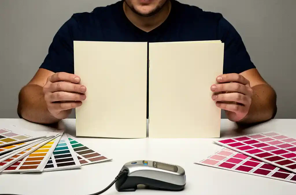
You can prevent color differences between print runs by working with fixed color standards such as Pantone references, certified ICC color profiles, and written agreements with your printer regarding tolerances and approval procedures. The more consistently you establish and maintain these standards, the lower the risk of visible variations between jobs. In this article, we answer the most frequently asked questions about color consistency when printing brand identity materials. If you have questions about your specific situation, you are always welcome to contact us.
What causes color differences between print runs?
Color differences between print runs arise from variations in ink composition, paper type, press settings, ambient temperature, and the time elapsed between two jobs. Even minor deviations in any one of these factors can lead to noticeable color shifts, particularly with flat color areas or subtle tones that are characteristic of brand identity materials.
The most common causes are:
- Ink density: Small fluctuations in the amount of ink per square centimeter directly result in lighter or darker output.
- Paper type and coating: Coated paper absorbs ink differently than uncoated paper, causing the same color values to appear differently.
- Press calibration: Presses that are not regularly calibrated produce inconsistent results, especially over longer periods.
- Environmental conditions: Humidity and temperature in the print shop affect the drying and adhesion of ink.
- Varying operator judgment: When color approval is done visually without an objective measurement standard, human interpretation plays a role.
Awareness of these factors is the first step. The next step is establishing standards that keep variation manageable.
What is the difference between Pantone, CMYK, and RGB for brand colors?
Pantone is a system of fixed, numbered spot inks that offers the most reliable color reproduction for print. CMYK is a four-color printing process suited for full-color print work, but more susceptible to variation. RGB is a light-based color model used exclusively for screens and is not directly suitable for print production.
Pantone for brand colors
Pantone colors are mixed as a proprietary ink type and are therefore independent of the printing process. A Pantone color has a unique number — such as Pantone 485 for a specific red — and produces an identical result at any printer that uses the same system. This makes Pantone the gold standard for brand colors where exact reproducibility is essential, such as logos and brand-specific color areas.
CMYK for full-color printing
CMYK works with four base inks (cyan, magenta, yellow, and black) combined in halftone dots. It is more cost-efficient than Pantone for complex images or print jobs with many colors, but the result depends on press calibration and the ICC profile used. For brand colors in CMYK, it is advisable to document in writing the CMYK values that provide the closest visual match to the Pantone reference.
RGB for digital applications only
RGB values are intended for screens and are never used directly as print specifications. Files submitted to a printer in RGB are automatically converted to CMYK, which can lead to unexpected color shifts. Always ensure that print files are supplied in CMYK or as Pantone spot colors.
How do I set up a color profile for consistent print results?
Setting up a color profile for consistent print results involves selecting an ICC profile that matches the printing process and paper type, applying that profile in your design software, and supplying it alongside the print file. The most widely used profile for European offset printing is ISO Coated v2 for coated paper or ISO Uncoated for uncoated paper.
In practice, the process works as follows:
- Ask your printer which ICC profile they use for your specific combination of press, ink, and paper.
- Set this profile as the working space in Adobe InDesign or Illustrator via Edit > Color Settings.
- Convert all placed images to the same profile before exporting the file.
- Export the PDF with an embedded color profile (PDF/X-4 or PDF/X-1a, depending on your printer’s requirements).
- Have a digital proof or physical press proof approved before the full print run begins.
A correctly configured color profile does not eliminate all variation, but it significantly reduces the margin and gives both you and your printer a shared reference point.
Why do digital and offset printing differ in color?
Digital and offset printing differ in color because they use fundamentally different ink systems. Offset printing uses oil-based inks transferred via a printing plate, while digital printing uses toner or inkjet. This leads to structural color differences even when identical color values are entered.
In offset printing, colors are built up through the physical distribution of ink across the paper, resulting in richer and deeper color rendering for large print runs. Digital printing offers more flexibility for short runs and variable print work, but the color output depends on the specific printer and the toner or ink system used.
If your brand materials are printed using both digital and offset processes, it is advisable to document separate color values for each process that are as visually close to each other as possible. An experienced print partner can advise you on the best achievable match for each technology. At our print solutions, we work with both digital and offset printing and align color profiles to the desired result for each job.
What agreements should I make with my printer about color consistency?
The agreements you should make with your printer about color consistency include: documenting Pantone or CMYK reference values, defining acceptable color tolerances (Delta E values), establishing a proofing procedure, and retaining an approved reference print as a physical benchmark for future runs.
More specific agreements you can put in writing:
- Color specifications per color: Pantone number, CMYK values, and optionally HEX for digital applications.
- Delta E tolerance: Delta E is a measurable color deviation. A Delta E of 2 or lower is acceptable for most brand identity applications; discuss which threshold you and your printer will apply.
- Proofing procedure: Agree on whether you will approve a digital proof, a physical press proof, or a make-ready sheet before the full print run begins.
- Retention of reference materials: Specify that the printer retains an approved print as a reference for repeat orders.
- Paper specification: Record the exact paper type, weight, and coating, as a change in paper will automatically result in color differences.
The more precisely these agreements are documented, the less room there is for interpretation and the lower the risk of disappointment upon delivery.
How do I preserve approved color standards for future print runs?
You preserve approved color standards by maintaining a brand style guide containing all color values for each application, archiving a physical reference print, and storing the approved print files — including color profiles — in a central, accessible location. This system ensures that new employees, other suppliers, or a new printer always work from the same starting point.
A practical archive system consists of the following components:
- Digital brand style guide: Document all Pantone numbers, CMYK values, RGB values, and HEX codes per color and per application (logo, background, typography).
- Physical color archive: Store an approved proof or reference print in a dark, dry environment. Light and moisture degrade paper and ink over time, making the reference unreliable. Replace the physical reference periodically.
- Version control system for print files: Save print-ready PDF files with clear version numbers and dates, including the ICC profile used and the paper specification.
- Supplier log: Keep a record of which printer, which press, and which paper were used for each approved run. This makes reproducing results considerably easier.
Color consistency across multiple print runs is not a matter of luck, but of discipline in documentation and communication. With the right standards and agreements in place, you lay the foundation for brand materials that always look consistent — regardless of when or where they are printed. Would you like to discuss your print project or request a quote? Get in touch and we will be happy to help.
Frequently Asked Questions
How do I know if my current print files are ready for consistent color reproduction?
Check whether your print files are saved in CMYK (not RGB), contain an embedded ICC profile that matches the printing process, and whether all Pantone colors are correctly defined as spot colors rather than CMYK conversions. Use the preflight function in Adobe Acrobat or InDesign to identify common issues such as missing color profiles, RGB images, or incorrectly defined colors before sending the file to your printer.
What is an acceptable Delta E value for brand identity materials, and how do I measure it?
For most brand identity applications, a Delta E of 2 or lower is considered acceptable; for highly color-critical work, such as luxury packaging or premium brand materials, a Delta E of 1 or lower is sometimes required. Delta E is measured with a spectrophotometer, a device used by the print shop to objectively compare the printed color against the reference value. Ask your printer for a measurement report with the proof, so you have objective evidence that the color falls within the agreed tolerance.
Can I guarantee color consistency when printing with multiple printers?
Achieving fully identical color output across multiple printers is difficult to guarantee, but you can significantly reduce variation by prescribing the same Pantone references, ICC profiles, and paper specifications to every supplier and sending a physical reference print as a benchmark. Also ensure that all printers apply the same Delta E tolerance and that you have a proof approved for each new job. A certified print partner working in accordance with ISO 12647-2 offers the greatest assurance of consistent results across locations.
What should I do if the delivered print visibly deviates from the approved proof?
Document the deviation immediately with photographs and, if possible, a spectrophotometer measurement, and compare this against the written Delta E tolerance in your agreement with the printer. Contact the printer and refer to the approved reference print and the agreed tolerances; a reputable print partner will reprint the job or offer an appropriate solution. Prevent these situations in the future by always reviewing a make-ready sheet before the full print run begins.
How often should I replace or update my physical color archive?
Physical reference prints lose their reliability over time due to exposure to light, moisture, and air; ideally replace them every one to two years, or sooner if you notice visible discoloration or yellowing. Always store the reference in a dark, dry environment — preferably in a sealed archive box — and note the approval date and the conditions of the print run on the reference itself. Link the replacement of physical archive materials to a periodic review of your brand style guide, so that digital and physical standards always remain synchronized.
Is it worthwhile to invest in your own spectrophotometer as a client?
For organizations that regularly commission color-critical print work — such as annual campaigns, packaging, or brand-related point-of-sale materials — a spectrophotometer can be a worthwhile investment. With a device such as the X-Rite i1Display or a comparable model, you can measure proofs and delivered print runs yourself and objectively compare them against your reference values, without relying on the printer’s own measurements. For occasional print work, it is more efficient to assign this responsibility contractually to the printer and request measurement reports as part of the delivery terms.
What information should a good brand style guide contain for print color consistency?
A brand style guide that supports color consistency in print should contain at minimum the Pantone numbers, CMYK values, RGB values, and HEX codes for each brand color, supplemented by the corresponding ICC profiles and paper specifications for each application. Also include: the permitted Delta E tolerance, the approved CMYK conversions for both coated and uncoated paper, and the file formats and export settings that printers must use. The more specific and complete this document is, the less room there is for interpretation by internal staff, external agencies, or new print partners.
Related Articles
- What are the advantages of local printing versus central printing and distribution?
- Can I have my logo and corporate identity printed on promotional gifts and office supplies?
- How do I ensure my printed materials comply with local regulations in each country?
- What are the turnaround times for printing product documentation in multiple languages?
- How do you sync updates across multiple localised versions?