
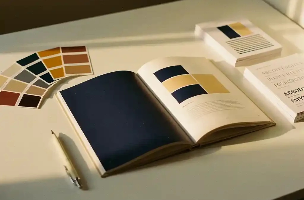
Making documentation look more professional starts with three things: a consistent visual style, professional layout through DTP, and quality print work. Whether it’s a technical manual, a product brochure, or multilingual user documentation, the visual presentation largely determines how seriously readers take the content. Have questions about how we approach this? Feel free to get in touch and we’ll be happy to help. In this article, we answer the most frequently asked questions about documentation design, house style, DTP, and print.
Which design elements instantly make documentation look more professional?
Documentation looks instantly more professional when you consistently use white space, a clear typographic hierarchy, a limited color palette, and aligned elements. These four basic principles allow readers to focus on the content without being distracted by visual noise.
White space is perhaps the most underrated design tool. Documents that are too densely packed with text and images give an impression of chaos, while well-used margins and line spacing give the reader room to breathe. A clear typographic hierarchy means that headings, subheadings, and body text are visually distinct from one another, allowing readers to grasp the structure of a document at a glance.
Color also plays a major role. A limited palette of two to three colors that align with your organization’s brand identity gives documents a cohesive, professional appearance. Random use of color has the opposite effect. Similarly, aligned elements — such as text boxes, images, and tables placed neatly on a grid — send a subtle but powerful signal of care and attention to detail.
How does a consistent house style improve document readability?
A consistent house style improves readability because readers can recognize and understand the structure of a document more quickly. When fonts, colors, icons, and formatting rules are the same across every document, readers don’t need to spend mental energy deciphering the layout and can focus entirely on the content.
Consistency works on multiple levels. At the level of a single document, it ensures that headings, paragraphs, and captions follow a predictable pattern. At the level of a product line or organization, it ensures that all documents — from installation manuals to marketing brochures — are experienced as a coherent whole.
In practice, you achieve this by working with style guides and templates. A style guide defines which fonts and sizes are used, how headings are formatted, and which colors are permitted. Templates translate these rules into ready-to-use file formats. For organizations producing documentation in multiple languages or for multiple markets, these are indispensable tools.
What is the difference between DTP and standard word processing for documentation?
The difference between DTP (desktop publishing) and standard word processing lies in the degree of control over visual layout. Word processors such as Word are designed for writing and editing text, while DTP software such as InDesign is designed for precise control over typography, layout, and print-ready output.
In a word processor, formatting is functional: you can choose fonts, apply bold and italic, and set basic formatting. But for complex documents with multiple columns, precise alignment, bleed images, and consistent styles across hundreds of pages, a word processor falls short. DTP software provides the tools to manage all of these elements professionally.
Another critical difference is the output. DTP files can be exported as print-ready PDFs with the correct color profiles, crop marks, and resolution. This is essential for professional print work. A document printed directly from a word processor will, in most cases, not meet the quality requirements of a print shop.
For organizations that regularly produce technical documentation, product manuals, or marketing materials, investing in DTP is therefore not a luxury but a necessity. We seamlessly combine DTP with translation and print, ensuring the entire documentation process runs efficiently.
How do you ensure documentation looks good in multiple languages?
Making documentation look good in multiple languages requires a layout that accounts for text expansion, reading direction, and language-specific typographic rules. A document that is perfectly formatted in Dutch may look cluttered in German because the text typically grows by 20 to 30 percent.
Text expansion is one of the biggest challenges in multilingual documentation. When an English text is translated into German or French, the volume of text increases. This means that text frames, buttons, and captions that fit perfectly in the source language may overflow or disrupt the layout in the target language. A skilled DTP specialist accounts for this during the design phase by creating flexible layouts.
For languages with a different reading direction, such as Arabic or Hebrew, the entire layout must be mirrored. Images, icons, and navigation elements that make sense to a left-to-right reader can be confusing for a right-to-left reader. This requires specific knowledge of the target market.
We translate and localize documentation in more than 90 languages while ensuring that the formatting is correct in every language. By integrating translation and DTP into a single workflow, we prevent layout errors from creeping in with each new language version.
What role does print quality play in the appearance of physical documentation?
Print quality largely determines the first impression that physical documentation makes. Paper quality, finishing, color accuracy, and binding method are tangible elements that readers experience immediately, before they have read a single word. High-quality professional printing reinforces the credibility of the content.
The choice between offset and digital printing has a direct impact on quality and cost. Offset printing is suited to large print runs and delivers consistent, high color quality. Digital printing is more flexible, more cost-effective for small runs, and enables on-demand production. The right choice depends on the print run, the desired quality level, and the turnaround time.
Finishing makes the difference between a document that looks ordinary and one that makes an impression. Matte or gloss lamination, embossing, foil stamping, and special binding methods give documentation a premium look and feel. For product manuals included in packaging, the finishing is also functional: a neatly folded, firmly bound manual is more user-friendly than a limp sheet of paper.
We offer a fully managed end-to-end service, from translation and DTP to printing and fulfillment. Whether it’s thousands of copies in bulk or a small on-demand run, we ensure the final result fits your budget, your timeline, and your quality expectations. Backed by ISO 9001 certification, you can be confident that every part of the process meets the highest quality standards.
Want to find out what we can do for your documentation? Get in touch and we’ll be happy to discuss the options.
Frequently Asked Questions
How do I get started creating a house style guide for my documentation?
Start by establishing the basics: choose two to three brand colors, select no more than two fonts (one for headings, one for body text), and set fixed margins and line spacing. Document these choices in a clear overview document, then create a template in your DTP software or word processor. Even a simple two-page house style guide will produce a noticeable improvement in consistency.
What are the most common mistakes when formatting technical documentation?
The most common mistakes are overusing fonts and colors, insufficient white space, inconsistent headings, and failing to account for text expansion in translations. Many organizations also start thinking about layout too late, meaning the design has to be adjusted to fit the content after the fact rather than the other way around. Working with a style guide and templates from the design phase onward prevents most of these problems.
Can I have existing Word documents converted into professional DTP files?
Yes, absolutely. A DTP specialist can use existing Word documents as a starting point and reformat the content in software such as Adobe InDesign, applying the house style consistently and preparing the file for print. This is a common approach for organizations that want to upgrade their existing documentation without having to rewrite the content. Do keep in mind that complex documents require more editing time.
How do I know whether to choose offset printing or digital printing?
The general rule is straightforward: choose offset printing for print runs above 500 to 1,000 copies where color consistency and a high level of finishing quality are important, and choose digital printing for smaller runs, short turnaround times, or when you regularly make small updates. For multilingual documentation where a smaller print run is needed per language, digital printing offers added flexibility. When in doubt, it’s worth consulting a print specialist who can compare the options based on your specific situation.
How long does it typically take to lay out and print multilingual documentation?
The turnaround time depends on the number of languages, the complexity of the layout, and the desired print run, but as a general guide, allow two to four weeks for a complete end-to-end process from translation and DTP to print. By combining translation and DTP in a single integrated workflow — as we do — the turnaround time is significantly reduced because no time is lost transferring files between different parties. Rush jobs are possible in many cases, but it’s always wise to plan well in advance.
What do I need to provide to get started with professional DTP and printing?
Ideally, you should supply a Word or PDF file containing the final text, your house style guide or brand guidelines, any images in high resolution (minimum 300 dpi), and a clear brief covering the desired format, print run, and finishing. Don’t have a house style guide yet? We can develop a consistent layout based on existing materials, such as a logo or a previous document. The more complete your submission, the faster and more accurate the final result.
Is it possible to have documentation in multiple languages laid out and printed at the same time?
Yes, and this is one of the key advantages of working with a partner that handles translation, DTP, and printing under one roof. By processing all language versions in parallel within a streamlined workflow, inconsistencies between versions are avoided and turnaround times remain manageable. We handle documentation in more than 90 languages and coordinate the planning and production of all versions so that you can deliver all language versions simultaneously.
Related Articles
- Can I have my logo and corporate identity printed on promotional gifts and office supplies?
- What sustainable printing options are available for my product documentation?
- What is a fulfilment partner and do I need one?
- How do I distribute printed product manuals to dealers across Europe?
- How do you ensure inclusive localisation?